
1. Stating the obvious... Monday's price moves were a shock. Also, they were a record spike in volatility.

Source: WSJ Daily Shot; As of 2/7/18
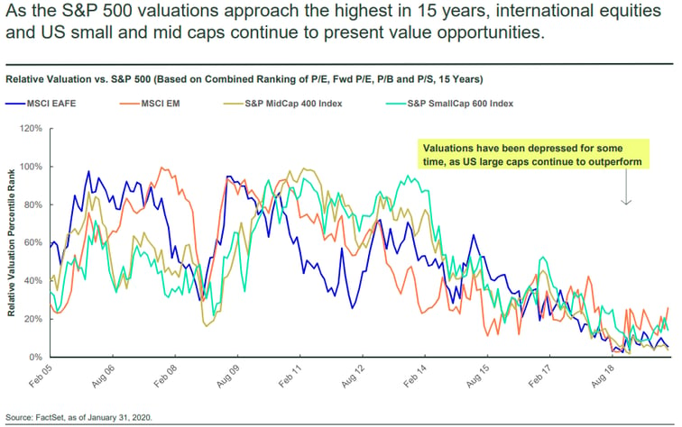
2. When FOMO turns to Oh no!
Source: WSJ Daily Shot; As of 2/5/18
3. Worth noting.

Source: WSJ Daily Shot; As of 2/7/18
4. Why some REITs are struggling.

Source: WSJ Daily Shot; As of 2/7/18
5. Expectations of inflation are driving the markets.
Source: WSJ Daily Shot; As of 2/6/18
6. A state by state look at wage growth which is driving the inflation fears.

Source: WSJ Daily Shot; As of 2/6/18
7. Proof that when markets enter periods of failure, all risk assets tend to correlate...they all go down together!

Source: WSJ Daily Shot; As of 2/6/18
8. A classic case of the data set being too short. One has to go back into the 1970's to see a cyclical rising rate environment...this doesn't even go back to 2000!

Source: WSJ Daily Shot; As of 2/6/18
9. Will this correction derail the global growth story?

Source: WSJ Daily Shot; As of 2/6/18
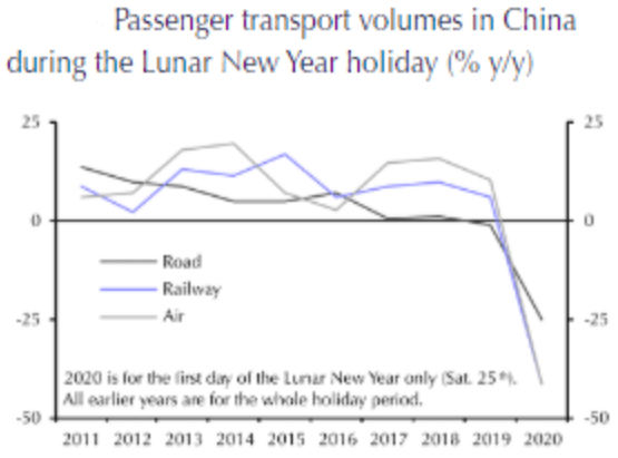
10. A temporary reprieve? Rising rates and inflation fears kicked this off...
Source: WSJ Daily Shot; As of 2/5/18
11. Increased UST bond issuance is stocking the higher rate fears.

Source: WSJ Daily Shot; As of 2/7/18


