
1. Since the trough in the markets in 2009, the only significant corrections were preceded by Mutual fund and ETF outflows. The net outflows over the past 6 months has been about $60 billion.

Source: ICI, As of 10/2/17
2. Trouble ahead for one of the largest emerging markets?
Source: WSJ Daily Shot, As of 10/3/17
3. Is value back in vogue?
Value shares are narrowing their underperformance.

Source: WSJ Daily Shot, As of 10/3/17
4. U.S. equity sector flow as of end of Q3 2017.
Data: Bloomberg, State Street Global Advisors, As of 9/29/17
5. U.S. Fixed Income flows at end of Q3 2017.
Data: Bloomberg, State Street Global Advisors, As of 9/29/17
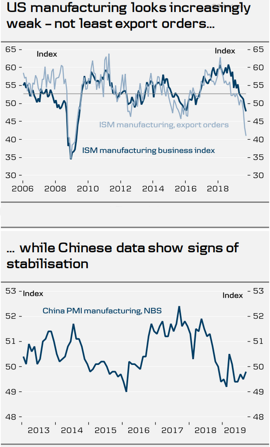
6. Encouraging, but how often are the pundits just plain wrong?

Source: WSJ Daily Shot; As of 10/4/17
7. Can volatility turn negative?
Source: WSJ Daily Shot; As of 10/3/17
8. A historical perspective on the VIX...
Source: WSJ Daily Shot; as of 10/4/17
9. With global interest rates so low, it makes sense that corporations took/take advantage of the low cost debt. However, the levels seem extreme and we wonder how much has a variable rate?

Source: WSJ Daily Shot; As of 10/4/17
10. Is the correction over?

Source: WSJ Daily Shot; As of 10/4/17
11. Looks like companies in emerging markets are also took/taking advantage of the low rates. What could possibly go wrong?
Source: WSJ Daily Shot; As of 10/4/17
